

New York Presbyterian
Replacing stacks of paper forms with a digital patient guide that put patients in control of their own care — and gave practitioners their time back.
The Challenge
Paper-based care coordination was failing patients before they even arrived
New York Presbyterian was sending patients home with stacks of forms, checklists, and printed instructions covering surgeries, pediatric visits, and births. Each care touchpoint added more paper. Patients were confused, forms were lost or incomplete, and appointment cancellations were climbing — all before a single procedure began.
The Approach
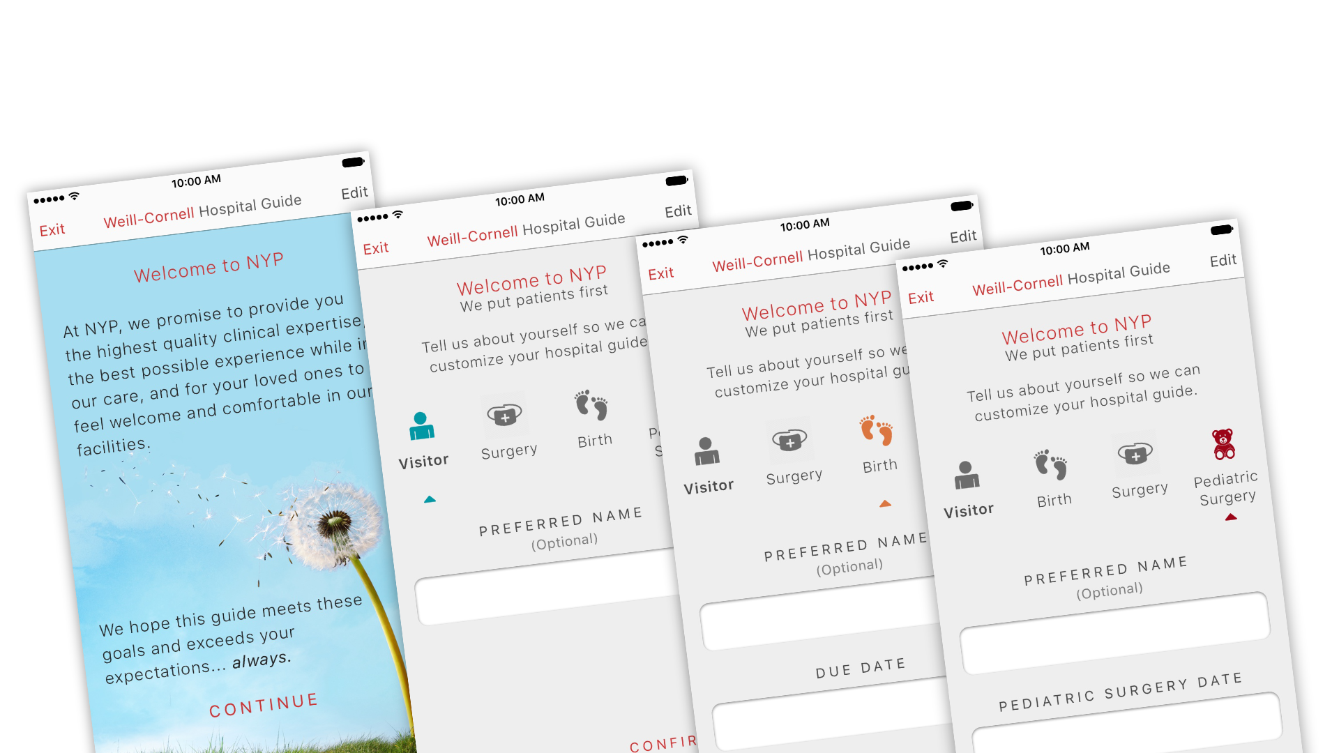
A single onboarding guide that met patients where they were
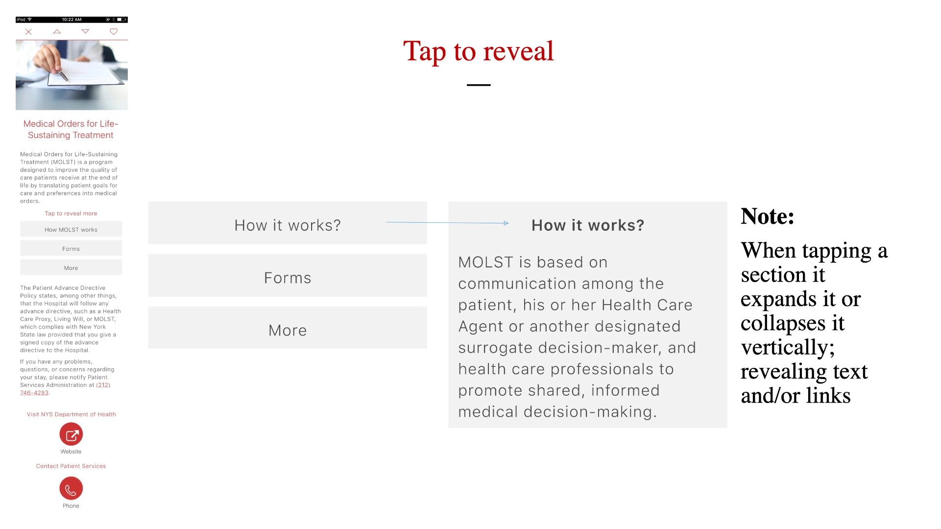
I mapped the full patient journey across care types and identified where the paper process was creating the most friction. The solution was a mobile-first onboarding guide that delivered the right information at the right time — interactive reading, embedded video content, and procedure-specific alerts sent directly to patients' devices. The experience was designed to feel like a companion, not a form.
The Outcome
Patients in control, practitioners freed up
By shifting information delivery to the patient's device, the app dramatically reduced appointment cancellations, mishandled forms, and the administrative burden on care teams. Practitioners no longer needed to chase down paperwork or re-explain instructions — patients arrived prepared. The result was a measurable reduction in delays and a care experience that reflected the quality of the institution.